


Brand Guidelines
The elements of our brand’s visual identity.

Core Design Principles
These four principles establish the foundation of Midigator design. They serve as the guiding light for all design decisions at Midigator. By referencing these principles, we are able to align our product, culture, values, and marketing with our core mission of helping businesses get back to business.

Eliminate ambiguity. Enable people to see, understand, and act with confidence.

Streamline and optimize workflows. Intelligently anticipate needs to help people work better, smarter, and faster.

Create familiarity and strengthen intuition by applying the same solution to the same problem.

Demonstrate respect for people’s time and attention through thoughtful and elegant craftsmanship.
Logo
Our brand signature.

Logo Color Options
The logo works best in full color on a white background. This style should be used whenever possible. Additionally, deep gray (G800) can also be used on light colored backgrounds when a single color is required. For dark or colored backgrounds, the logo should always be white.


Logo Orientation
When necessary, based on space or aspect-ratio, the logo can be displayed in a vertical format. This is a secondary option and can be applied when spacing, content, or aesthetic preference permit. If possible, the horizontal orientation should be used.
Horizontal (Primary)
Stacked (Alternate)
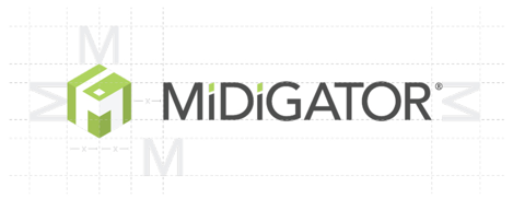
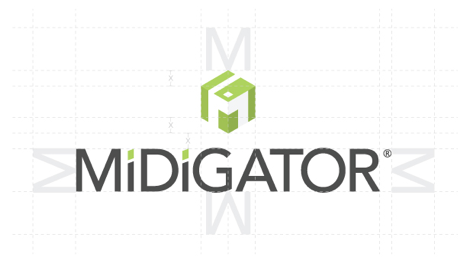
Logo Clearing Space
The “M” height of the wordmark is used to define the minimum required free space.
Icon
The icon can be used as a stand-alone element to represent the Midigator brand. The icon is especially useful when space is limited, as profile images, or paired with complementary sub-text.
The icon can be used in full 3D format or flat, single color. The ® should always be displayed when using the icon only.
Logo Guidance
Follow these rules when it comes to displaying the logo.
Avoid rotating the logo.
Avoid stretching or compressing the logo.
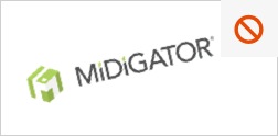
Avoid crowding the logo.

Avoid adding effects like shadows, dimensions and gradients to the logo.
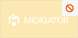
Avoid using a white logo on a light colored background.
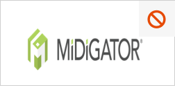
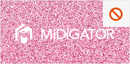
Avoid using the logo on busy backgrounds.
Avoid using a low resolution logo.
Brand Colors
Our primary palette uses our bright green to bring a boldness to our brand and is used in logical ways throughout product and marketing to guide the eye and highlight the important bits. The green is complemented with shades of cool gray to add balance and visual hierarchy.
| Color Swatch | Color | Hex | RGB | CMYK | PMS |
|---|---|---|---|---|---|
 | G300 - Brand Green | #AFD25C | 175, 210, 92 | 36, 0, 82, 0 | Pantone 367C |
 | N500 - Deep Gray | #4C4C4C | 76, 76, 76 | 66, 58, 57, 37 | Pantone 7540C |
 | N300 - Cool Gray | #A3A3A3 | 163, 163, 163 | 36, 0, 82, 0 | Pantone 7543C |
 | N50 - Light Grey | #F6F6F6 | 246, 246, 246 | 2, 2, 2, 0 | - |
Typography
We use clean, accessible, sans-serif fonts to reduce the friction between people and the product. With a simple, classic font, we’re able to remove distractions and improve the clarity and confidence in which people interact with our brand.
For accessibility, we use the online font, Open Sans. This font is easily displayed across all browsers, devices, and digital applications.
P Q R S T U V W X Y Z
a b c d e f g h i j k l m n o
p q r s t u v w x y z
P Q R S T U V W X Y Z
a b c d e f g h i j k l m n o
p q r s t u v w x y z
O P Q R S T U V W X Y Z
a b c d e f g h i j k l m n o
p q r s t u v w x y z
P Q R S T U V W X Y Z
a b c d e f g h i j k l m n o
p q r s t u v w x y z

